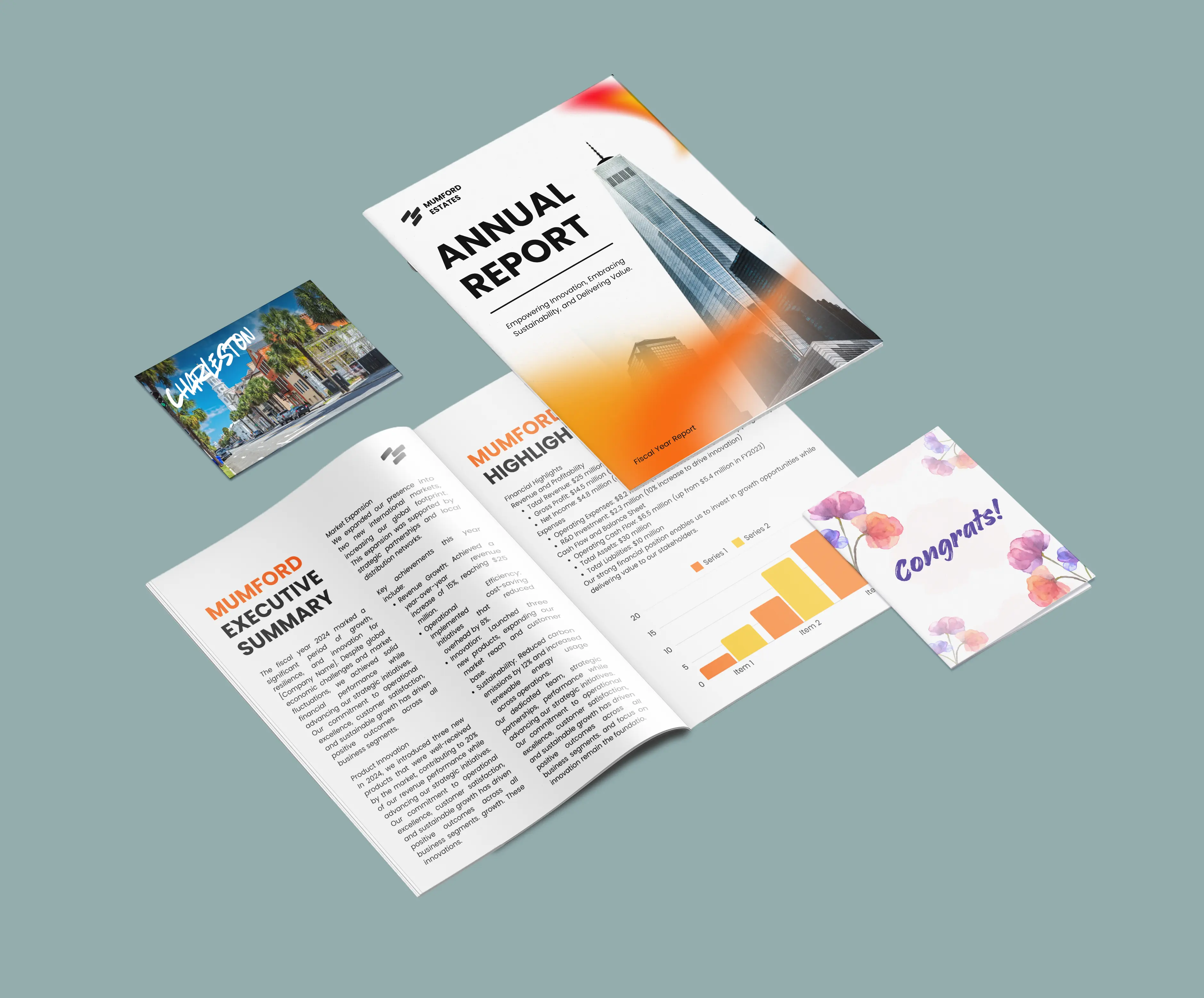
Quick Overview
Here are the key takeaways for understanding why printed colors can vary:
- Printed colors can look different from screen colors because screens use light while printers use ink.
- Some colors cannot be reproduced exactly in print.
- Paper, artwork files, finishes, and viewing conditions can affect a print’s appearance.
- Proofing your files helps you review how colors may appear before printing.
Why do printed colors look different from my screen?
Screens and printers create color differently. Screens emit light to display color, while printers use ink applied to a surface such as paper.
| RGB | CMYK | |
| Color Method | Light from red, green and blue pixels | Ink from cyan, magenta, yellow and key (black) |
| Use | Screen and digital designs | Printed materials |
| Color Range | Wider range of bright colors | Smaller range designed for print |
Because RGB can display a wider range of colors than CMYK can print, they may change when converted for print.
Why Bright and Vivid Colors Are Most Affected
Bright colors can look different in print because screens can display a wider range of colors than CMYK printing can reproduce.
Colors most likely to change include:
- Electric blues
- Neon greens
- Bright oranges
- Highly saturated colors
When RGB colors are converted to CMYK, they are adjusted to the closest printable color. This can make them appear less bright, slightly darker, or less saturated.
Pro Tip: If your design uses bright or highly saturated colors, review how they appear after conversion before confirming your order. Our CMYK vs RGB guide explains why these color changes happen and how color conversion works.
How Paper Stock Affects Printed Colors
The paper you choose affects how the ink appears. Different surfaces absorb and reflect ink differently, which can change color strength, contrast, and overall appearance.
| Paper Type | How It Affects Color | Best For |
| Gloss | Strong contrast and vibrant colors | Photography and image-heavy designs |
| Matte | Smooth finish with balanced color | Professional marketing materials |
| Uncoated | Softer colors with a natural appearance | Books and stationery |
| Recycled | Warmer tones and softer color results | Eco-focused products |
Why does my file look blurry?
Low-resolution images can look sharp on screen but appear blurry when printed because screens and print require different levels of image detail.
Print quality depends on your artwork file’s resolution. Low-resolution images contain less detail, which can cause:
- Blurry images
- Pixelated edges
- Soft-looking text or graphics
Images downloaded from websites or created for digital use are often saved at a lower resolution because screens require fewer pixels than printed products.
Increasing the size of a low-resolution image does not add missing detail. The original image quality affects the final print result. For more guidance on image quality and preparing artwork for print, see our Image Resolution guide.
Pro Tip: If your files contain low-resolution images, use our Image Enhancer tool in your order’s Artwork tab to improve image quality before confirming your order, which can help improve image clarity before printing.
Screen Calibration and Viewing Conditions
Your screen settings can affect how you see colors before printing. Factors such as monitor brightness, color settings, color temperature, and screen technology can change how they appear.
Most screens display colors with higher brightness and saturation than physical printed materials. This can make printed colors appear softer compared with your original design.
Lighting also affects printed color. The same print may appear different under daylight or under artificial lighting.
How can I check colors before printing?
There are two ways to review color before production:
Soft Proofing
A downloadable proof provides an on-screen preview of how colors may appear when printed to help you identify possible color changes.
Physical Proofing
Ordering a physical proof before production allows you to review the final appearance before committing to a larger print run.
A physical proof is recommended for projects where color appearance is especially important, including:
- Brand colors
- Product photography
- Artwork reproduction
Production Methods Can Affect Color
The printing method used for your order can affect the final color appearance. Small-quantity orders and larger print runs may use different production methods and technologies, resulting in slight differences.
For example, a test print may use digital printing, while a larger order may use offset printing depending on the order requirements.
If you order a test print before placing a larger order, let us know and provide your previous order number. This helps us review your requirements and provide the best guidance for your order.
When Color Differences Are Expected
Small differences can occur; we follow industry standards and quality controls to help maintain consistent color results.
| Situation | Is this normal? |
| Bright RGB colors appear slightly softer in print | Yes |
| Colors printed on matte paper appear softer and less vibrant than colors printed on gloss paper | Yes |
| Colors on physical prints look slightly different from your screen | Yes |
| Colors change slightly under different lighting | Yes |
| Missing colors, severe banding, or obvious print defects | No |
When To Contact Us
If your print has missing colors, visible damage, obvious defects, or results that appear significantly different from your confirmed artwork, submit a problem report so our team can review your order.
For color-critical projects, contact us before ordering so we can advise on file setup, paper choice, finishes, and proofing options.
Additional Resources
You can learn more about printing colors and preparing your files with these guides: