Saturation Extremes
You rarely get satisfactory results if you use a very high or low ink saturation for a single color. Any value under 10% may not print whatsoever, while values over 90% may be impossible to differentiate from a solid color. This issue is most frequent in black and white printing, where you only use a single color from CMYK (Cyan, Magenta, Yellow, Black).
The K in CMYK stands for Key, but we use the term black for simplicity. The Key plate is a metal plate that holds the detail in the image during the printing process.

Too Light
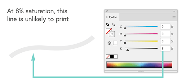
The gray line opposite is easy to see on your screen. However, at just 8% saturation (2% below the recommended minimum), it will be barely visible when printed. But if we increase the saturation to at least 10%, it will be more visible in print.
Too Heavy
You can see the color difference between the small dark circle and the lighter circle on the graphic (right). However, when printed, the 91% saturation value of the large circle and the 100% saturation value of the darker circle will be almost indistinguishable - you would only see a single dark circle.
Your screen uses RGB light to produce color, while a printing press uses CMYK ink to create colors. Because the ink saturation of both shapes exceeds the recommended 90% limit, the whole area ends up darker when printed on paper than when viewed on your computer screen. You can learn more about the difference between CMYK and RGB here.

Ink Saturation Scale
We covered the saturation scale for a single color (right). For example, if you print in black and white, your only CMYK color would be K (black). Ink saturation is also important when printing with all four CMYK colours.
When choosing CMYK colors for your design, we make them using a scale of 0% to 100%. This measures how much of each ink we need to add to create the final color.
The more ink you add, the darker the final color is. So if each pixel in your print file has an ink saturation level between 0% and 100%, and you have 4 CMYK colors, then the maximum possible saturation for each pixel is 400%.
For example, the blue/green color we use for printing our Mixam logo is C:65 M:0 Y:28 K:0. In other words, we set the Cyan at 65%, the Magenta at 0%, the Yellow at 28%, and the black at 0%. The total is 93% out of a possible 400%.
In the blocks of color below, your screen will show four different circles, ranging from 100% saturation to 400% saturation. You can see how they are created by increasing the percentage of each CMYK color.
Once you exceed 250% saturation, the paper becomes heavily saturated with ink, possibly increasing printing costs and drying times due to the volume of ink used in the production process.
Best Saturation Level
In the same way that 91% black compared to 100% black looks different on a computer screen but will appear equally dark when printed. 300% CMYK saturation will also look equally dark as the 400% CMYK saturation when printed.
For this reason, we recommend setting your darkest color choices within 150% to 250% total CMYK saturation. This range is perfect for keeping colors bright and clear without becoming muddy from extra ink.
Saturation works best when used sparingly. Even a deep, rich black can be incredibly vivid with less than 200% saturation. You only need to balance the overall CMYK values of your colors accordingly.
Paper Types
Some paper types will absorb more ink than others. Silk and gloss papers are the best options for clear and crisp printing. Uncoated and recycled papers are also available options and soak up ink more quickly, becoming much darker and may have a bleed effect. The type of paper you use is vital regarding saturation level settings.
